GPT Image 2912 × 1136
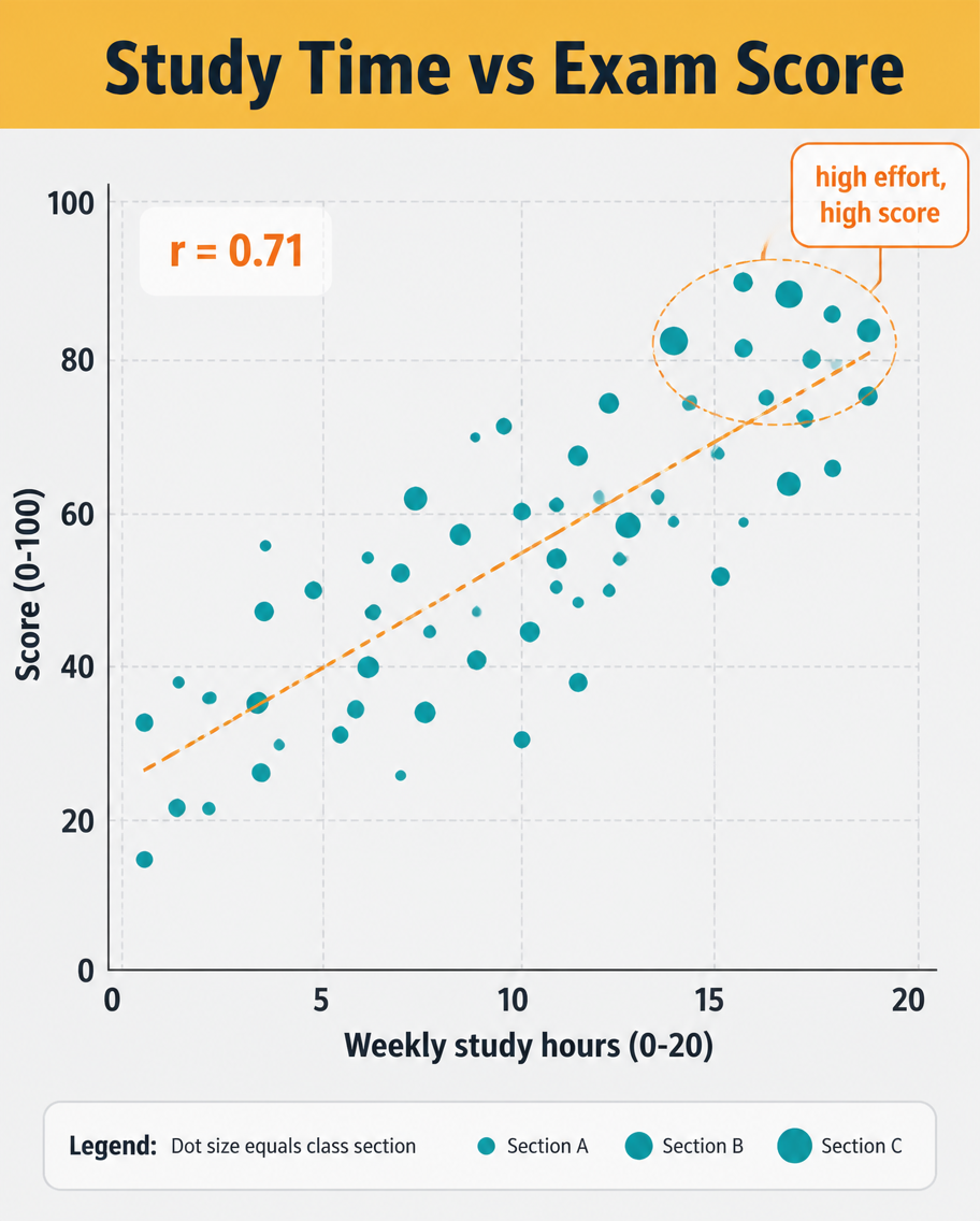
Study Hours Vs Scores Scatter
A
API Models收录于 2026/8/10
Prompt Analysis
A data infographic, 4:5, titled 'Study Time vs Exam Score'. A scatter plot dominates: roughly 40 dots scattered upward-right, each a small teal circle, with a dashed orange trend line rising through them and a label 'r = 0.71'. X-axis 'Weekly study hours (0-20)', Y-axis 'Score (0-100)', light grid. A highlighted cluster near the top-right is circled with a callout 'high effort, high score'. Header on a mustard band, pale grey plot background, clean sans-serif, small legend explaining dot size equals class section.
相关作品
查看更多

根据原 Prompt 和模型重建的起始画布